Muscular States
The concept for Appeal Health Club & Spa has been inspired by the muscle system of the human body. The muscles expand and contract through human movement. This metaphor is significant to the project because the fitness areas focus on flexing or expanding muscles, while the spa areas focus on relaxing or contracting muscles. The way muscles appear, feel, and operate suggests the approach to the solution, specifically through line, color, unity, rhythm, proportion, and emphasis.
Relaxed
In the spa areas, the design solution will promote the feeling of serenity and relaxation through the use of the following elements and principles.
- Horizontal lines will convey repose.
- Analogous cool colors will create a peaceful and soothing spa atmosphere.
- Low contrast and less saturated hues will add to the calming effect.
- Unity will be achieved by using repetition of base colors and smaller scales.
- Emphasis will be created by changing the color intensity and the level of detail.

Energized
In the fitness areas, the design solution will promote the feeling of energy through the use of the following elements and principles.
- Diagonal lines will convey movement.
- Complimentary colors will create a lively atmosphere.
- High contrast and saturated hues will add to the exciting effect.
- Unity will be achieved by using repetition of the base colors and larger scales.
- Emphasis will be created by complimentary accents and changing the level of detail.
.

The overall design solution will generate a relaxing ambiance in the spa areas, while the fitness areas will have a more energetic atmosphere. These two main spaces will differ, but remain in harmony with one another through unifying elements.
Concept Board

Mood Board
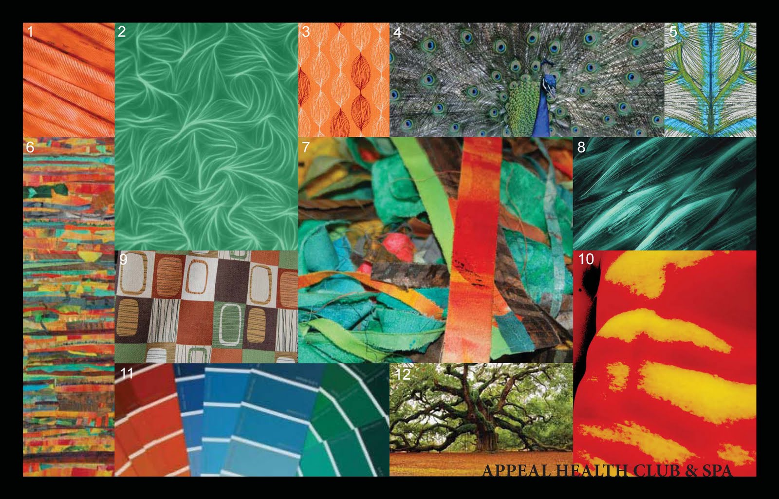 Mood Board Annotations
1. Close up the muscle strands are straight like the lines in the design will be. This photograph portrays them as diagonal lines like what will be used in the fitness areas to convey energy.
2. The fibrous pattern of muscles on a microscopic level provides inspiration for the possible patterns that can be used in the material selection. In the spa area, the smaller proportions are derived from the contracted size of a relaxed muscle in comparison with the expanded size of a flexed muscle. In the fitness area, the larger proportions are derived from the expanded size of a flexed muscle in comparison with the contracted size of a relaxed muscle. The cool color overlay represents the most important base color that will be used in both the spa areas and the fitness areas to bring unity to the two areas. The spa area will use a less saturated version of this color for serenity, while the fitness are will saturate it slightly more to bring a little more excitement to the space.
3. This is also a pattern derived from the fibers of a muscle. The orange color can be used to accent the blue and bring emphases to a particular space.
4. The connection of muscles fibers is similar to the fan of feathers on male peacock. The very bright blue accents on the feathers represent the same subtle bursts of saturation that bring interest and excitement to the spaces. The boldness that the peacock is known for is the same boldness that I want to bring to the fitness areas. The colors are almost iridescent when viewed from particular angles. This iridescent can bring emphasis to the most important design elements and details. The mix of green and blue are the analogous colors that will bring serenity.
5. This hand-drawn sketch of what the muscles of the back look like. The human body has the same symmetry that the facility will use in the floor plan.
6. The biggest challenge for the project will be to unify the fitness design and the spa design. The spa needs to be relaxing and serene, while the fitness area needs to be energetic. This photo shows a harmony of many colors and strips that will help me with this challenge. These horizontal strip show the straight horizontal lines that will be used in the spa area for repose. The combination of varying colors and strips show how the two different spaces will come together in a patchwork unity. The analogous cool colors will be accented with the oranges. The neutral browns bring an earthy feel that is very trendy in health clubs currently.
7. The photo is the best representation of the unified feel that the facility needs to have from all of the elements that are coming together in the fitness areas and the spa areas. The diagonal lines and the horizontal converge in harmony, bringing excitement to some areas of the photo and repose to others. The base colors of blues and greens vary from high contrast to low contrast and more saturated to less saturated. This shows the diversity these basic colors can create. The more saturated and high contrasting areas are exciting, while the less saturated and low contrasting areas are more restful to the eye. The pops of orange represent the complimentary accent and its lively effect on the areas it is used. The overall unity of these diverse combinations shows that it can be successful to bring the relaxed together with energized in a harmonious union of elements and principles of the design.
8. This peek into the human muscle tissues reveals the cells in a very regular symmetrical pattern. This is an enlarged version of the patter that can inspirational to the materials selection in the fitness area. A smaller version of the same pattern can be used in the spa area. This repetition of the same pattern in different sizes can be a technique used to bring unity to the building as a whole.
9. This pattern is similar to an abstract version of the cells of the body. The colors show the way the earth tones can come together with the orange accents in a way that is pleasing to the eye and harmonious.
10. The human body presents symmetry on the exterior as well as the interior. A toned stomach has muscles that are mirror images on both the left and right. Symmetry is a naturally occurring incidence that will also be purposefully used in the project design. Symmetrical layouts and materials choices will bring comfort to all viewer who have seen this all their life in the human body. The symmetry will also help with wayfinding, in that the general layout will mirror itself on opposite side of the building.
11. This portrays the colors that will be used in the design. The majority of colors will be analogous cool colors. The blues and greens will be used more frequently than the orange accents. Since blue and orange are compliments, the use of them together will bring emphasis where used. These colors can then be more saturated to be energetic or less saturated to be relaxing.
12. Nature will prove to be an important source for the design. While relaxing or working their muscles, the users will want to feel connected to nature in a way. The multitude of glass walls will make nature a part of the view. Therefore, the interior will need to play on that connection to nature.