 http://shopmasons.com/about/
 Now that we have done a few commercial projects, we have been introduced to the idea of branding the design environment. I was recently on a shopping trip to buy a pair of Tom's shoes. Since Tom's shoes are only sold in a limited number of stores, my quest took me to Mason's.
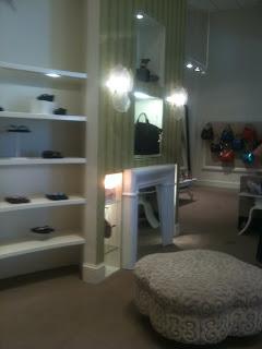
It is a high end clothing, shoe, and accessories store located in the Northwest Arkansas Mall and on Joyce Street. The Mason's on Joyce Street definitely had a brand appearance to it. As a college student trying to pay my bills, I felt very out of my element in such a high end store. I started to analyze that the sophistication of the store was not just because of the high price on the tags, but also because of the interior design.
 High ceilings give the space a lofty feeling. There are also very large chandeliers with down-lights that made the crystals sparkle like diamonds. The area set aside for the dressings rooms had sweeping curves and upholstered walls. The sconces on the wall were glass shells over a mirror faux fireplace.
Everything about Mason's says luxury. The visual appearance of the store aids in giving the products greater perceived value. A person who desires luxury would definitely feel that they were getting a luxurious and sophisticated product. The experience further emphasized the importance of giving our commercial clients a brand appearance that fits their products and needs.

Great post!
ReplyDelete