Saturday, April 23, 2011
Easter Egg Designs
Some people have mastered the art of designing Easters. I am not one of those people. I still appreciate the easy to design Paas packages. However, I do like to let the creative juices flow on some of my eggs. I know that this isn't interior design, but all things creative and design related will help a design expand their thinking and creativity. Since today was a stormy day, it was a perfect day to stay in and dye some eggs. We ended up with 20 egg designs and 8 dinosaur eggs. These were the designs Dustin, my boyfriend, and I came up with.
For kits, we bought the Paas glitter egg kit and the dinosaur kit. The next ones are the eight dinosaurs we created, and you can see the yucky weather outside (we had tornadoes all over northwest Arkansas and Oklahoma last night).
Some tips I can give for your own Easter egg designs:
1. Search for ideas on Google (I didn't, but there were some good things on there that might inspire you
2. White crayons can be used to keep the dye off a certain area of the egg, therefore allowing hand drawn designs and words.
3. For a splatter effect, dip an old toothbrush in the dye and then run your thumb from the front to the back about 4 inches from the egg.
4. For a swirly design, place a drop of dye on the egg and then blow the drop around in different directions. Repeat with other colors.
5. You don't have to dip the egg all the way into the dye cups. You can dip it half way in one color and then flip it, and dip it half way in another color. Or even one third and one third and leave a white center.
6. If you have a paintbrush, you can dip the brush in the dye and brush on custom designs.
7. An Easter basket would be a great way to display the eggs.
HAPPY EASTER EVERYONE!
Friday, April 15, 2011
Hospitality Design
A lot of people assume that hospitality design is hotel design. Well the hospitality design industry includes the interiors of hotels, resorts, spas, restaurants, and casinos. If I go into commercial interior design, this is the field I want to be in.
So, I did some investigation on hospitality blogs and websites that are out there and came up with this list for you to read and enjoy.
Hospitality Design Magazine Website:
http://www.hospitalitydesign.com/
Hospitality Design Magazine Blog:
http://www.hdtalks.com/
Hospitality World Network Website:
http://www.hospitalityworldnetwork.com/
Dale's Hospitality Design Inspirations Blog:
http://www.hdinspirations.com/
Restaurant Hospitality Interior Design Articles:
http://restaurant-hospitality.com/interior_design/
Interior Design Magazine's Hospitality Articles:
http://www.interiordesign.net/channel/Hospitality.php
Interior Design Magazine's 2010 Hospitality Giants:
http://www.interiordesign.net/article/532849-2010_Hospitality_Giants.php
Saturday, April 9, 2011
Fairytale Park
Please, fayetteville, expand on this castle and make it larger than life. It would be the coolest place to go if it were expansive and allowed adults to become kids again. But I give the sculptor and revision sculptor props on a job well done. I LOVE THIS LITTLE CASTLE. I want one and I am going to take some fun pictures on it someday soon when there are no kids on it.I came home and did some research on the park play area that was unlike any play area I had ever seen.
So, here is what I found on accessfayetteville.org about our little castle.
Location: 675 Park Ave
Wilson Park "Castle" History
An active spring emerges from behind the iron door with the Dogwood flower on it. Prior to 1979 , there was an unsightly concrete spring house located over the spring. The presence of this spring house is why this site was chosen for the "Castle". During the early 1900's, this spring fed into what was known as Trent Pond, the local swimming hole which was located exactly where the ball field is now. In the early 1930's the current swimming pool was constructed, eliminating the need for the old swimming hole.
During the 1960's and '70's Wilson Park became increasingly popular, the spring house area was considered unsafe and unattractive. As a result, all agreed that this area had the potential for a creative, interactive park feature to be designed and constructed. In the late 1970's a contest was held to present ideas to citizens, Park's staff and Fayetteville Parks and Recreation Advisory Board (PRAB).
Artist and Sculptor Frank Williams won the contest with a scale model of what would eventually be known as "The Castle". Originally, Frank named it "Seven Points". The castle features seven cement "points" and a rock in the foot bridge with the number "7" in it. Soon after completion in 1981 it was nicknamed "The Castle".
The Castle has become increasingly popular over the years, receiving thousands of visitors annually. Over time, structural integrity of the castle began to weaken, requiring renovations to the original project, which were completed in 1999 and 2004. Rock walls on the planting spaces were improved, aggregate walkways were added, entry areas enlarged, the bridge rails were re-built, and the dam below the bridge was reinforced. Created by Artist Eugene Sargent other improvements include the addition of Ferro-cement benches that resemble flowers and leaves, a flower fountain was fashioned for the pond, and in 2009 the "worm" retaining wall was added.
*Find more pictures searching "Wilson Park, Fayetteville AR 72761", and click photos
Sunday, April 3, 2011
Holy Design
When my thoughts started flying, I decided that the church's values and beliefs were most important. This church is not trying to be showy and do not want a status symbol church building. So the functionality of the building is more important than the aesthetics. They are very non-traditional and want people to feel free to worship however they are lead. This means that pews and other church norms do not have to apply to the new building. The music is a big part of the service. We are encouraged to join with the praise team if you feel like adding to the mix with your own musical or vocal talents. This means the stage needs to be large enough for everyone and easy to manipulate the equipment. They are also very focused on ministry and outreach. This would make the fellowship hall another important place that would be multifunctional.
I have a rough floor plan that someone sketched out, but I want to use my strengths in space planning to create my own floor plan. I also know that my drawing and documents will have to go through someone else since I am only a student in design right now. I will be working on this project more later on since it is only in the pre-design phase. I was just wanting to start up the thinking process and pick some brains for inspiration.
So tell me, what are your thoughts on how to design a church building in the physical realm that will help you to place yourself in the spiritual realm?
Saturday, March 19, 2011
Secret Spaces
One of our jobs as interior designers is to create an experience for the end user. How amazing would it be to have two completely different first experiences of the same space! One time through the space you experience the things that are seen. The second time through the space you experience the unseen. If both of those experiences are made mind blowing by the interior design, then you have just created something special, original, and a design that people will continue to talk about after they leave. As a christian, it is a great metaphor for how beautiful life is in the things we can see and how amazing it is when you take into account the things you cannot.
In order to create this experience through design, you need some ideas of how to create secret spaces. So, I have compiled a bank of images that show secret hideaways and passages for your viewing pleasure...and mine.
This company is called Creative Home Engineering. They can be found at hiddenpassageway.com. Their most popular types of hidden passageways are bookcases, dressers, fireplaces, and mirrors or paintings. They also have security options that include concealed vault doors, panic room doors, armored doors, biometric access control, and surveillance.
A designer named Lolly Lindeman came up with a design called the grensgeval. It is a door or wall that can change positions because of the two hinges that it hangs on. This changes the way you can open it every time you do. The base design could easily be disguised by whatever is attached to it as long as it does not interfere with the was the hinges maneuver. You can find more information on her website www.lottylindeman.nl.
Saturday, March 12, 2011
Evaluation of Myself
Personal Mission Statement
- To strive to achieve the most excellent work to my capability while enjoying what I do
- To balance my personal life with my professional life, so that my quality of life will be wonderful
- To try new things, never pass up a unique opportunity, and always seek personal growth
- To always base my decisions on my spiritual beliefs and never betray them for success or money
- To make a positive impact on the people and places I come in contact with throughout my life
What is your number one interest in interior design?
- Restaurant Design
- When my mother was trying to decide on a floor plan for the house they were going to build, there were many magazines full of residential floor plans. I would take parts of each floor plan I liked and combine them into one dream house. Plus, the fact that I was also surrounded by the construction business through my families careers factored into my career path a bit.
- Experience in AutoCAD, SketchUp, Revit,
- Experience Hand Drafting, Hand Rendering, Hand Sketching
- Most stages of the design process: Programming, Schematic Design, Design Development, & Contract Document Preparation
- Best Skill: Space Planning
- Excellent communication skills, easily flexible, very organized, strong work ethic, relates well to others, problem-solver, eye for detail, creative thinker, eager to learn
with the interviewer?
- I want to expand my knowledge of interior design in every area that presents the opportunity
- Consistently present myself as a profession in the profession of interior design
- Complete an internship that teaches needed skills and knowledge while conducting myself as a professional
- Networking with professionals in the field of interior design
- Winning first place in the Arkansas Third Congressional Art competition and having my art piece hang in the U.S. Capital for a year
- Completing Studio 2, 3, 4, & 5
- Maintaining a GPA of over 3.7/4.0 throughout my college career
- Intern at an interior design firm or an architecture firm with an interior design department
- Complete my Bachelor of Interior Design
- Begin a career in a field of interior design that interests me
- Maintain a GPA of 3.5/4.0 or greater until graduation
- Learn to play the piano or keyboard
- Become a licensed interior designer
- Pass the LEED exam
- Become a licensed real estate agent
- Create many award winning designs
- Build a 401K
- Have many of my designs published
be
- Run an interior design business
- Complete internship
- Graduate with B.I.D
- Work for 2 years under a licensed interior designer or architect
- Pass the NCIDQ
- Maintain the requirements to keep my license in interior design
- Pass the LEED exam
- Start a career at an interior design firm
- Receive promotions at an interior design firm
- Take classes or gain a degree in business
- Build my client base
Friday, March 4, 2011
Art Nouveau
Retrieved from dictionary.com
From the first time I saw the style of Art Nouveau, I loved it. If asked, it would be my favorite historical period of interior and exterior design. The famous whiplash imagery is what draws me in. One of the countries booming with Art Nouveau influence in the 1890s was Belgium. There are many things that are distinctly Belgium: Belgium waffles, Belgium beer, and Victor Horta. I admire Victor Horta's Art Nouveau style. Therefore, I am providing a tribute to Art Nouveau and Victor Horta. These are so beautiful.
Friday, February 25, 2011
Big Small Rooms
Benjamin Moore
Super White 02
Benjamin Moore
Witching Hour 2120-30
Dunn-Edwards
Nomadic Taupe DE6192
Fine Paints of Europe
Delft Blue 4003
Farrow & Ball
Claydon Blue 87
Forrow & Ball
Brinjal 222
Christopher Peacock Paint
Mercury CPP1 18
Benjamin Moore
Horizon 0C-53
Benjamin Moore
Alexandria Beige HC-77
Porter Paints
Fresh Curry 6254-2
Benjamin Moore
Shades of Spring 537
Benjamin Moore
Appalachian Brown 2115-10
Websites:
http://www.benjaminmoore.com
http://www.dunnedwards.com
http://www.finepaintsofeurope.com
http://us.farrow-ball.com
http://www.peacockpaint.com
http://www.ppgporterpaints.com/
Sunday, February 20, 2011
Brand & Price Tags
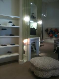
It is a high end clothing, shoe, and accessories store located in the Northwest Arkansas Mall and on Joyce Street. The Mason's on Joyce Street definitely had a brand appearance to it. As a college student trying to pay my bills, I felt very out of my element in such a high end store. I started to analyze that the sophistication of the store was not just because of the high price on the tags, but also because of the interior design.
High ceilings give the space a lofty feeling. There are also very large chandeliers with down-lights that made the crystals sparkle like diamonds. The area set aside for the dressings rooms had sweeping curves and upholstered walls. The sconces on the wall were glass shells over a mirror faux fireplace.
Everything about Mason's says luxury. The visual appearance of the store aids in giving the products greater perceived value. A person who desires luxury would definitely feel that they were getting a luxurious and sophisticated product. The experience further emphasized the importance of giving our commercial clients a brand appearance that fits their products and needs.
Sunday, February 13, 2011
Igloo
The last two weeks have been marked with record snowfall in the area. School was canceled, and there was more snow outside than I had ever seen in my life. We decided to let the children inside us out and build an Igloo. Of course, we built it for fun as southerns that already had a home. Our method was to pile the snow into a large mound, pack it down, and then carve out the inside. The entrance was on a downhill slope. So, to enter we would lay on a sled and slide all the way in. The inside was comfortable enough for three people to sit up in. It was also surprisingly less cold inside our southern style igloo than it was outside.
It got me thinking about how igloos are often the primary homes of individuals in colder climates. I can begin to understand how proper construction of the igloo along with furnishings can make an igloo comfortable enough to live in.
As the snow melts and the temperatures rise, our little temporary igloo is shrinking. In colder climates, I imagine that the low temperatures keep igloo homes from melting.
For your viewing pleasure, I am including more sophisticated igloo designs. After all igloos are a form of residential design.
Saturday, February 5, 2011
Wedding and Event Design
Research: to start, the designer would need to sit down with the client and find out all of their expectations, desires, wants and needs. The designer could get an idea of the style of wedding or event that the client desires and then look up some precedent studies of that kind of style. In this stage, the main goal is to get inspired in the right direction.
Space Planning: This is my favorite step in the design process, so I know I would love it in wedding and event design. The two main spaces for a wedding would be one for the ceremony and one for the reception. The image above is a furniture floor plan for a wedding reception space from http://www.maisondesbontemps.com /reception.html.
As I was looking around I found that sometimes event designers use the same software we use. The images below show an AutoCAD creation juxtaposed with the end result (see http://www.pacificpartycanopies.com/resources/cad/weddingfor250/ for more).
There are many design steps in between space planning and final decoration decisions (FF & E or furniture, fixtures, and equipment in interior design). The final design is completed and specifications are made for installation and set up.
All around I am intrigued by the thought of carrying a design out to the end for a wedding or event. It would take attention to detail, meeting and exceeding the clients needs and desires, and creating a space that is both functional and aesthetically pleasing. This career path could be very exciting and rewarding, so I will keep it as a definite option.
Sunday, January 30, 2011
The Sitch in the Kitch
As the famous Frank Lloyd Wright always said, the kitchen is the heart of the home. I know this is true of anywhere I live because I love cooking. Not only do I love cooking, but when we have a home cooked meal in my house, it brings everyone together. The only downfall is that I live in an apartment. The appliances do not function to their fullest. There is nothing innovative. My kitchen provides me with the basics to get meals cooks.
Therefore, I dream of living in a house one day with innovations that aide me in cooking. This is why I am interested in Kitchen Distributors, Inc. They are located here in
This begs me to consider them as an option for my internship this summer. Since I have a strong draw to residential interior design, this would build my skills in built-in kitchen cabinetry design. Even if I do not work for them this summer, I still think that they are great at designing kitchens. They are at least one business that hold kitchen design to a high standard to make the work of cooking simple, easy, and enjoyable.
Saturday, January 22, 2011
Sink Into Something More Innovative
I am on a search to archive products and ideas that will make my designs more modern, innovative, and unique. When I came across the Elkay sinks and products, I fell for their designs. The best part about it is their vast array of selections and versatility. For materials, you can get copper, granite, fine fireclay, and stainless steel. For shapes, you can get the traditional ovals and rectangles, or you can get more unique shapes such as a footprint, martini glass, spiral shells, an island in the center, or the Mystic curvilinear sink. In fact the Mystic was voted "Best Sink of the Year" in 2007 Interior Design Magazine. The sinks can be top mounted, under-mounted, or custom built. One of their motto's is "You imagine it, we build it." As long the design is less than 80 inches, the size, shape, finish and overall design is up to you. I love it! Another neat addition to their options the collegiate licensing sinks. For those of you who know me know that I attend University of Arkansas, and Elkay has a Razorback logo sink. So for all of you Hogs fans, you can have a lovely sink in your kitchen that will display your devotion. There is also an entire section with links for Design Professional in the residential and commercial fields. Everyone should check out the interesting designs on their website below. I know I'm going to try and find every excuse to use one these sinks in my next design.
www.elkayusa.com