Monday, February 13, 2012

Floor Plan

Zoning:
  • Blue = Spa
  • Green = Fitness
  • Orange = Staff
  • Red = Cafe
  • Purple = Shop

The first floor seen above will contain the arrival/reception/lobby for the the fitness area at the main entrance. The fitness area takes up the entire second floor. However, there are three group fitness rooms located on the first floor with. Two of the vertical circulation with elevators and stairs are convenient to the first floor fitness area and reception. This allows for the connection between the two fitness zones.

The spa entrance is located at the right side of the building on the first floor. The separation of the spa and fitness arrivals will ensure a different experience for the users of each space. Circulation will allow for views to the external environment from lobby and waiting areas as well as when traveling the corridors themselves.

The main fitness floor on the second floor has yet to be developed with furnishings and equipment, but it will be divided into cardio equipment, strength equipment, free weights, and a functional training area. The room that are seen are group fitness and private training along with the obvious men's and women's locker rooms in the center.

This plan is still in the development stage, and I would love any and all feedback for improvement!

Thanks everyone, enjoy the snow!

Sunday, February 5, 2012

Top Ten Spaces

For my final project, I will need to have detailed furniture, finishes, and equipment selected for ten of my spaces. The following is a list of the spaces I will have in building according to my programming:

General Spaces
  • 2 Arrivals (one for the fitness area and one for the spa area)
  • 2 Receptions (one for the fitness area and one for the spa area)
  • 2 Lobby/Waiting (one for the fitness area and one for the spa area)
  • 4 Restrooms (men's and women's for the fitness area and men's and women's for the spa area)
  • 1 Cafe
  • 1 Supply Shop
  • 4 Laundry Rooms
  • 6 Custodial or Storage Closets
  • 1 Staff Break Room or Lounge
  • 2 Staff Locker Rooms (one men's and one women's)

The Fitness Areas
  • 6 Group Fitness Rooms
  • 1 Main Gym Floor (will be subdivided into section)
  • 2 Locker Rooms (one men's and one women's)
  • 2 Private Training Rooms
  • 1 Diet & Weight Loss Consultation Room
  • 5 Offices

The Spa Areas
  • 10 Individual Treatment Rooms (each containing small private restroom)
  • 10 Couple Treatment Rooms (each containing small private restroom)
  • 5 Offices

From these spaces I have derived what I believe to be the top ten spaces that need to be displayed most in depth in the final presentation. The following list is in order starting from what I believe to be the most important:

  1. Reception Typical
  2. Lobby/Waiting/Lounge Typical
  3. Main Gym Floor
  4. Group Fitness Typical
  5. Individual Spa Treatment Room Typical
  6. Couple Spa Treatment Room Typical
  7. Cafe
  8. Supply Shop
  9. Office Typical
  10. Locker Room Typical

Please, let me know your opinion on the order of importance or if you think one of the spaces mentioned in the first portion needs to replace one of the top ten in the detailed displayed list.

Thank you! Wish me luck on being productive and working out the best floor plan from block plans I am working on now. Have a great week!

Tuesday, January 24, 2012

Senior Project Concept

APPEAL HEALTH CLUB & SPA

Muscular States

The concept for Appeal Health Club & Spa has been inspired by the muscle system of the human body. The muscles expand and contract through human movement. This metaphor is significant to the project because the fitness areas focus on flexing or expanding muscles, while the spa areas focus on relaxing or contracting muscles. The way muscles appear, feel, and operate suggests the approach to the solution, specifically through line, color, unity, rhythm, proportion, and emphasis.

Relaxed
In the spa areas, the design solution will promote the feeling of serenity and relaxation through the use of the following elements and principles.
  • Horizontal lines will convey repose.
  • Analogous cool colors will create a peaceful and soothing spa atmosphere.
  • Low contrast and less saturated hues will add to the calming effect.
  • Unity will be achieved by using repetition of base colors and smaller scales.
  • Emphasis will be created by changing the color intensity and the level of detail.
These design choices will create more intimate spaces in the spa area.


Energized
In the fitness areas, the design solution will promote the feeling of energy through the use of the following elements and principles.
  • Diagonal lines will convey movement.
  • Complimentary colors will create a lively atmosphere.
  • High contrast and saturated hues will add to the exciting effect.
  • Unity will be achieved by using repetition of the base colors and larger scales.
  • Emphasis will be created by complimentary accents and changing the level of detail.
These design choices will create more vivacious spaces in the fitness area
.

The overall design solution will generate a relaxing ambiance in the spa areas, while the fitness areas will have a more energetic atmosphere. These two main spaces will differ, but remain in harmony with one another through unifying elements.


Concept Board


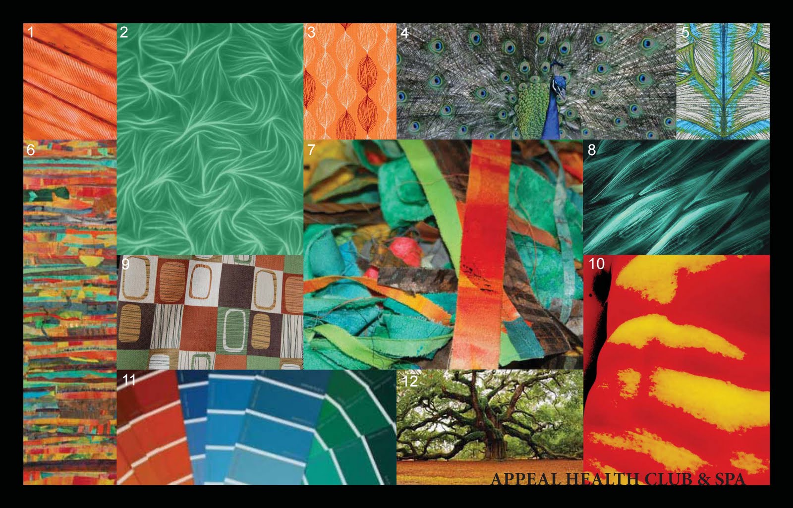
Mood Board

Mood Board Annotations

1. Close up the muscle strands are straight like the lines in the design will be. This photograph portrays them as diagonal lines like what will be used in the fitness areas to convey energy.

2. The fibrous pattern of muscles on a microscopic level provides inspiration for the possible patterns that can be used in the material selection. In the spa area, the smaller proportions are derived from the contracted size of a relaxed muscle in comparison with the expanded size of a flexed muscle. In the fitness area, the larger proportions are derived from the expanded size of a flexed muscle in comparison with the contracted size of a relaxed muscle. The cool color overlay represents the most important base color that will be used in both the spa areas and the fitness areas to bring unity to the two areas. The spa area will use a less saturated version of this color for serenity, while the fitness are will saturate it slightly more to bring a little more excitement to the space.


3. This is also a pattern derived from the fibers of a muscle. The orange color can be used to accent the blue and bring emphases to a particular space.

4. The connection of muscles fibers is similar to the fan of feathers on male peacock. The very bright blue accents on the feathers represent the same subtle bursts of saturation that bring interest and excitement to the spaces. The boldness that the peacock is known for is the same boldness that I want to bring to the fitness areas. The colors are almost iridescent when viewed from particular angles. This iridescent can bring emphasis to the most important design elements and details. The mix of green and blue are the analogous colors that will bring serenity.

5. This hand-drawn sketch of what the muscles of the back look like. The human body has the same symmetry that the facility will use in the floor plan.

6. The biggest challenge for the project will be to unify the fitness design and the spa design. The spa needs to be relaxing and serene, while the fitness area needs to be energetic. This photo shows a harmony of many colors and strips that will help me with this challenge. These horizontal strip show the straight horizontal lines that will be used in the spa area for repose. The combination of varying colors and strips show how the two different spaces will come together in a patchwork unity. The analogous cool colors will be accented with the oranges. The neutral browns bring an earthy feel that is very trendy in health clubs currently.


7. The photo is the best representation of the unified feel that the facility needs to have from all of the elements that are coming together in the fitness areas and the spa areas. The diagonal lines and the horizontal converge in harmony, bringing excitement to some areas of the photo and repose to others. The base colors of blues and greens vary from high contrast to low contrast and more saturated to less saturated. This shows the diversity these basic colors can create. The more saturated and high contrasting areas are exciting, while the less saturated and low contrasting areas are more restful to the eye. The pops of orange represent the complimentary accent and its lively effect on the areas it is used. The overall unity of these diverse combinations shows that it can be successful to bring the relaxed together with energized in a harmonious union of elements and principles of the design.

8. This peek into the human muscle tissues reveals the cells in a very regular symmetrical pattern. This is an enlarged version of the patter that can inspirational to the materials selection in the fitness area. A smaller version of the same pattern can be used in the spa area. This repetition of the same pattern in different sizes can be a technique used to bring unity to the building as a whole.

9. This pattern is similar to an abstract version of the cells of the body. The colors show the way the earth tones can come together with the orange accents in a way that is pleasing to the eye and harmonious.

10. The human body presents symmetry on the exterior as well as the interior. A toned stomach has muscles that are mirror images on both the left and right. Symmetry is a naturally occurring incidence that will also be purposefully used in the project design. Symmetrical layouts and materials choices will bring comfort to all viewer who have seen this all their life in the human body. The symmetry will also help with wayfinding, in that the general layout will mirror itself on opposite side of the building.

11. This portrays the colors that will be used in the design. The majority of colors will be analogous cool colors. The blues and greens will be used more frequently than the orange accents. Since blue and orange are compliments, the use of them together will bring emphasis where used. These colors can then be more saturated to be energetic or less saturated to be relaxing.

12. Nature will prove to be an important source for the design. While relaxing or working their muscles, the users will want to feel connected to nature in a way. The multitude of glass walls will make nature a part of the view. Therefore, the interior will need to play on that connection to nature.


Saturday, April 23, 2011

Easter Egg Designs


Some people have mastered the art of designing Easters. I am not one of those people. I still appreciate the easy to design Paas packages. However, I do like to let the creative juices flow on some of my eggs. I know that this isn't interior design, but all things creative and design related will help a design expand their thinking and creativity. Since today was a stormy day, it was a perfect day to stay in and dye some eggs. We ended up with 20 egg designs and 8 dinosaur eggs. These were the designs Dustin, my boyfriend, and I came up with.

For kits, we bought the Paas glitter egg kit and the dinosaur kit. The next ones are the eight dinosaurs we created, and you can see the yucky weather outside (we had tornadoes all over northwest Arkansas and Oklahoma last night).

Some tips I can give for your own Easter egg designs:

1. Search for ideas on Google (I didn't, but there were some good things on there that might inspire you

2. White crayons can be used to keep the dye off a certain area of the egg, therefore allowing hand drawn designs and words.

3. For a splatter effect, dip an old toothbrush in the dye and then run your thumb from the front to the back about 4 inches from the egg.

4. For a swirly design, place a drop of dye on the egg and then blow the drop around in different directions. Repeat with other colors.

5. You don't have to dip the egg all the way into the dye cups. You can dip it half way in one color and then flip it, and dip it half way in another color. Or even one third and one third and leave a white center.

6. If you have a paintbrush, you can dip the brush in the dye and brush on custom designs.

7. An Easter basket would be a great way to display the eggs.

HAPPY EASTER EVERYONE!

Friday, April 15, 2011

Hospitality Design

It seems hospitality design is the theme of my week. In my pro practice class we were to research and present about a design field that interested us. I chose hospitality design. Then in my human factors class we had reading to do about hospitality design, and we have had two class discussion about it this week. Might as well continue with the theme in my blog.

A lot of people assume that hospitality design is hotel design. Well the hospitality design industry includes the interiors of hotels, resorts, spas, restaurants, and casinos. If I go into commercial interior design, this is the field I want to be in.

So, I did some investigation on hospitality blogs and websites that are out there and came up with this list for you to read and enjoy.

Hospitality Design Magazine Website:
http://www.hospitalitydesign.com/

Hospitality Design Magazine Blog:
http://www.hdtalks.com/

Hospitality World Network Website:
http://www.hospitalityworldnetwork.com/

Dale's Hospitality Design Inspirations Blog:
http://www.hdinspirations.com/

Restaurant Hospitality Interior Design Articles:
http://restaurant-hospitality.com/interior_design/

Interior Design Magazine's Hospitality Articles:
http://www.interiordesign.net/channel/Hospitality.php

Interior Design Magazine's 2010 Hospitality Giants:
http://www.interiordesign.net/article/532849-2010_Hospitality_Giants.php

Saturday, April 9, 2011

Fairytale Park

It was a gorgeous day in the town of Fayetteville, AR. With not a lot of homework due too fast, I took a mental break day. My boyfriend and I packed a picnic of chicken sandwiches, cooked in my company's Bayou Bourbon Glaze (If you are curious visit: tastefullysimple.com/web/jadamire). We had never visited Wilson Park before, but we had seen it once driving near campus. The park was alive with visitors. On a walk through the large trail that circles the entire park, we came across one of the children's play areas. It was the most whimsical castle that looked like it was not really for kids. I found myself jealous of these children, because the play area was not large enough for adults.

Please, fayetteville, expand on this castle and make it larger than life. It would be the coolest place to go if it were expansive and allowed adults to become kids again. But I give the sculptor and revision sculptor props on a job well done. I LOVE THIS LITTLE CASTLE. I want one and I am going to take some fun pictures on it someday soon when there are no kids on it.I came home and did some research on the park play area that was unlike any play area I had ever seen.

So, here is what I found on accessfayetteville.org about our little castle.
Location: 675 Park Ave

Wilson Park "Castle" History

An active spring emerges from behind the iron door with the Dogwood flower on it. Prior to 1979 , there was an unsightly concrete spring house located over the spring. The presence of this spring house is why this site was chosen for the "Castle". During the early 1900's, this spring fed into what was known as Trent Pond, the local swimming hole which was located exactly where the ball field is now. In the early 1930's the current swimming pool was constructed, eliminating the need for the old swimming hole.

During the 1960's and '70's Wilson Park became increasingly popular, the spring house area was considered unsafe and unattractive. As a result, all agreed that this area had the potential for a creative, interactive park feature to be designed and constructed. In the late 1970's a contest was held to present ideas to citizens, Park's staff and Fayetteville Parks and Recreation Advisory Board (PRAB).

Artist and Sculptor Frank Williams won the contest with a scale model of what would eventually be known as "The Castle". Originally, Frank named it "Seven Points". The castle features seven cement "points" and a rock in the foot bridge with the number "7" in it. Soon after completion in 1981 it was nicknamed "The Castle".

The Castle has become increasingly popular over the years, receiving thousands of visitors annually. Over time, structural integrity of the castle began to weaken, requiring renovations to the original project, which were completed in 1999 and 2004. Rock walls on the planting spaces were improved, aggregate walkways were added, entry areas enlarged, the bridge rails were re-built, and the dam below the bridge was reinforced. Created by Artist Eugene Sargent other improvements include the addition of Ferro-cement benches that resemble flowers and leaves, a flower fountain was fashioned for the pond, and in 2009 the "worm" retaining wall was added.


*Find more pictures searching "Wilson Park, Fayetteville AR 72761", and click photos

Sunday, April 3, 2011

Holy Design

The church I currently attend is in Lincoln, AR. Since it was only established 4 years ago, the current meeting ground is a store front in the downtown square. They have been wanting to build an actual church building for quite awhile now. One of the brothers even had a dream that he was standing in new church building. When my pastor found out I was an interior design student, they wanted me to help with the design process. This brought up the question...how do you design a place that is supposed to be holy and help people experience the spiritual realm when I am use to working in the physical?

When my thoughts started flying, I decided that the church's values and beliefs were most important. This church is not trying to be showy and do not want a status symbol church building. So the functionality of the building is more important than the aesthetics. They are very non-traditional and want people to feel free to worship however they are lead. This means that pews and other church norms do not have to apply to the new building. The music is a big part of the service. We are encouraged to join with the praise team if you feel like adding to the mix with your own musical or vocal talents. This means the stage needs to be large enough for everyone and easy to manipulate the equipment. They are also very focused on ministry and outreach. This would make the fellowship hall another important place that would be multifunctional.

I have a rough floor plan that someone sketched out, but I want to use my strengths in space planning to create my own floor plan. I also know that my drawing and documents will have to go through someone else since I am only a student in design right now. I will be working on this project more later on since it is only in the pre-design phase. I was just wanting to start up the thinking process and pick some brains for inspiration.

So tell me, what are your thoughts on how to design a church building in the physical realm that will help you to place yourself in the spiritual realm?